Primeline
Brand Identity Design & Art Direction
It doesn’t take deep analysis to identify that the trends within the trading and construction market have not evolved a whole lot over the past decade in the MENA Region. But as the saying goes, if it isn’t broken don’t fix it. Well, we broke it. And then fixed it, positioning Primeline in a contemporary way that breaks the rules of what is known and expected, paving a new trajectory for the market.
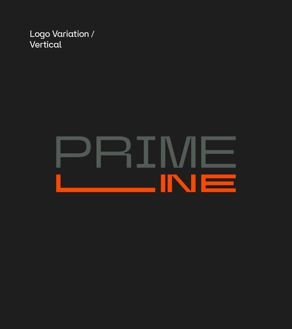
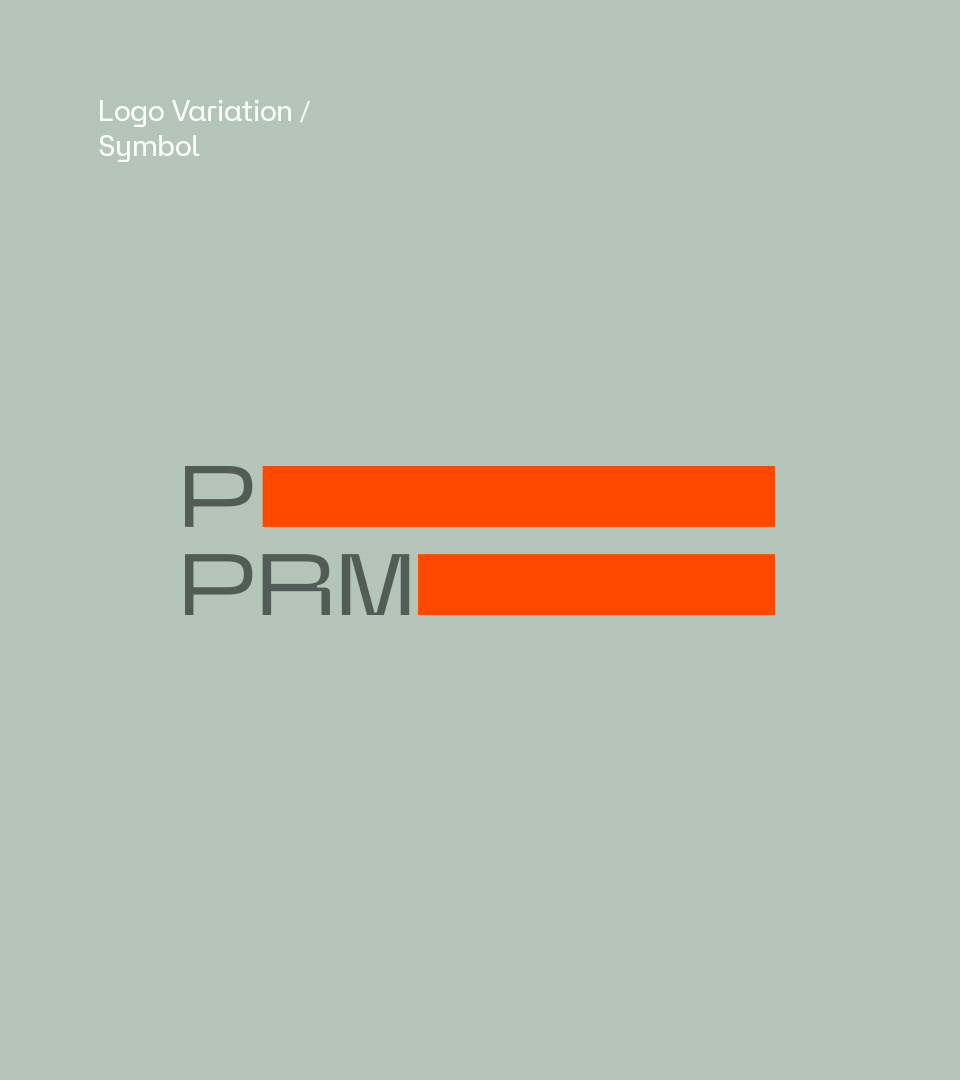
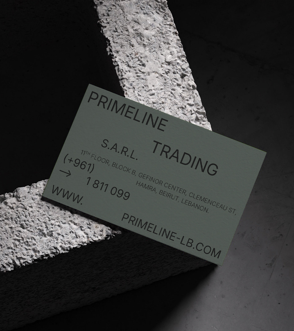
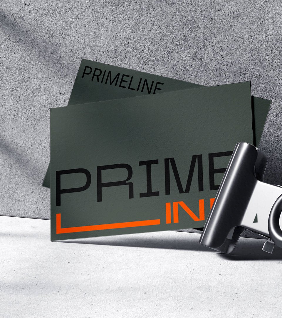
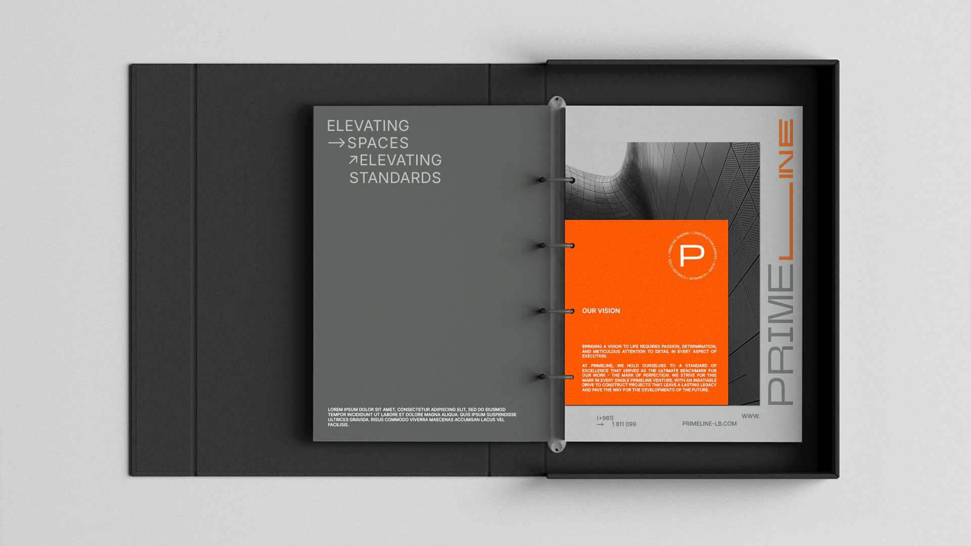
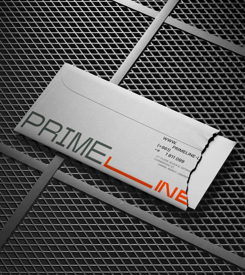
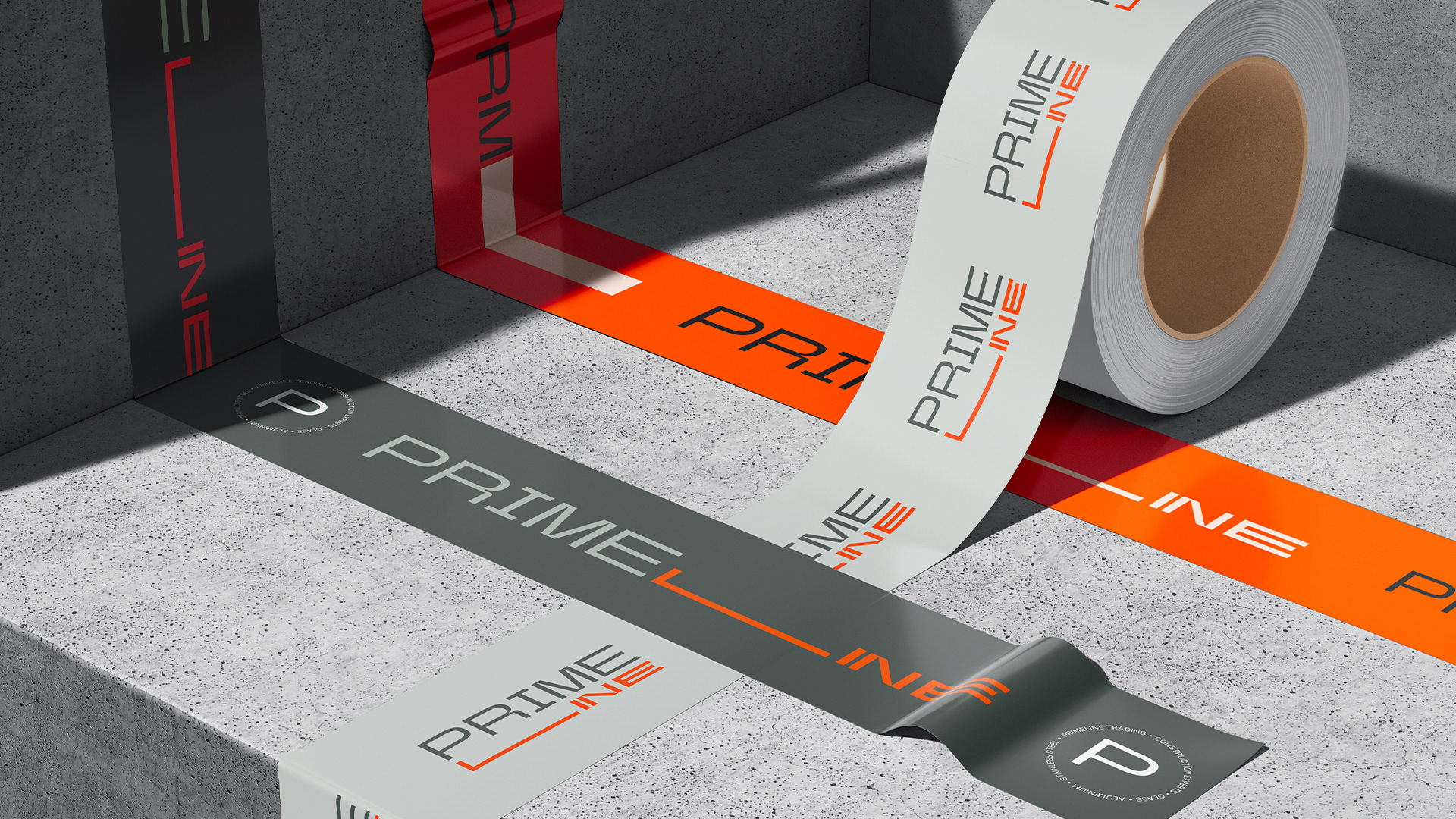
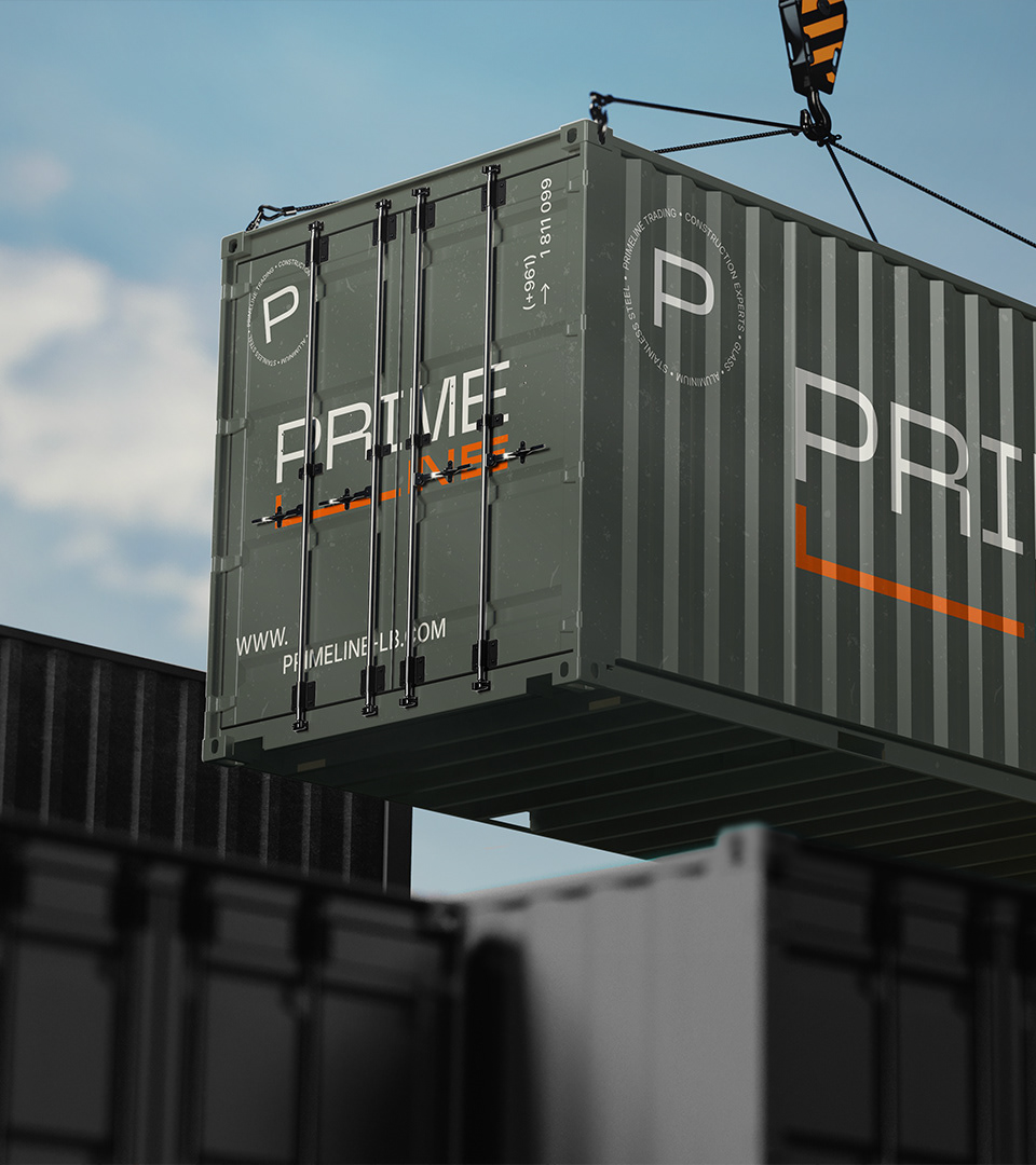
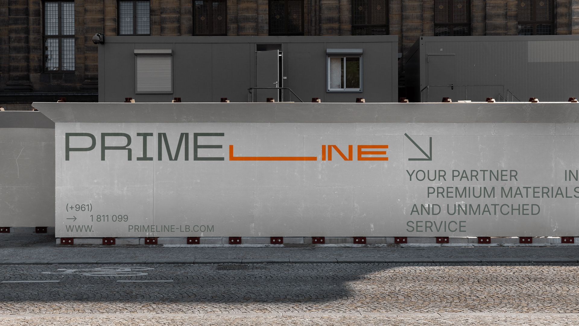
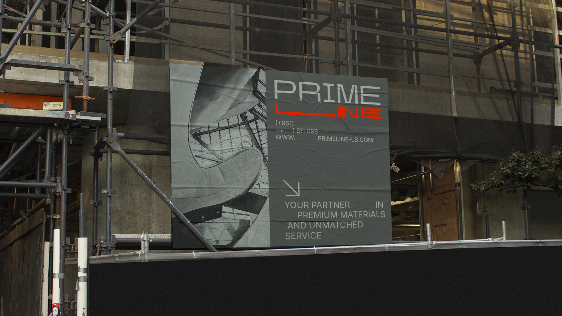
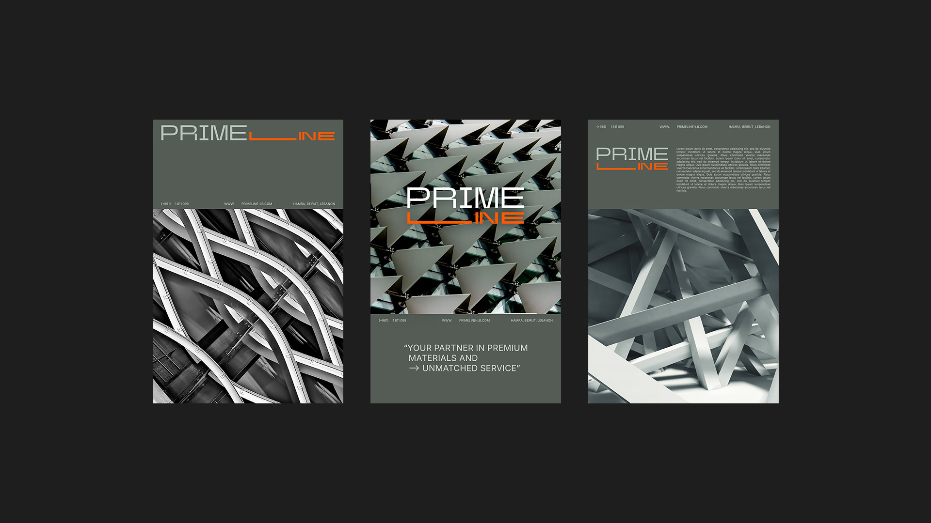
Centering the brand's logo mark at the heart of the brand, the brand identity uses unapologetically bold logomark and customised typography to convey an unmissable brand message and stand out against the sea of traditional trading and construction brands. The brand's outspoken tone of voice, colours and typography are balanced with a neutral brand palette and hand-drawn typographic elements reinforce the meticulously handcrafted production.